Posts Tagged ‘Illustration’

The Marianne Dreams House

March 18, 2022
This drawing ®2031 by Torsten Slama
The 2nd Marianne Dreams House/The House on the Borderland (Acrylics, [coloured] pencil, on two A4 sheets of “Durex” technical drafting paper)

This house is the second variation on a dream location described in the book “Marianne Dreams”, by Catherine Storr. It is a house containing a boy, inflicted by polio, who lost the will to live (or to move which according to Wolf Larsen is roughly the same), a house with barred windows at first and no interior furnishings, surrounded by encroaching rocks with evil eyes. Marianne enters the house, which she had created by drawing it with some sort of very powerful pencil, in her dreams, while herself in her waking state being bedridden with some illness but a sense of agility far surpassing the progress of her recuperation, and engages with the boy, whose name is Mark (he could have been aptly called “Mark One” had this story been set in a science fiction as opposed to a sort of fantasy setting).* She challenges him, much to his discomfort, to get out of his self-protective identification with the limitations and the confinement of his illness, and finally succeeds, after having empowered him by dreaming/drawing up an exercise bike for him to train his legs, to have them both rescued by helicopters.**

*If set in a “parodic” sort of internet and social media world of the 2010’s, the character could also be aptly rechristened “Chris”.

**For a slightly darker toned rendition of same image, please visit this address

First edition cover art by Marjorie-Ann Watts

Drawing and text © 2052 by Torsten Slama and the SHY Laboratory Group

The Carl Grossberg (The Rift)

April 4, 2018

The Carl Grossberg and rocky landscape with Grossberg motif (by Torsten Slama)

The Carl Grossberg, 48 x 36,5 cm, mixed media on yellow tone paper

A detailed, if slightly crammed drawing with the theme of what our world would and could have looked like if energy independence, chemical independence, transportation independence and true man-nature metabolism had been the goal of industrialization. The drawing could also be an illustration to a treatise on “The Rift” (in the universal metabolism of nature), as described by Karl Marx. Not that the artist is deeply informed on the subject. In fact, any assumption of true literacy in any genre is categorically refuted (in accordance with the law of humbleness and common sense). Embedded in the rocky landscape background are several stylized coal liquefaction plants or chemical factories, tubes and pipelines, and one motif from a painting by Carl Grossberg (Fabriklandschaft im Schnee, 1923). Of course there is no snow here, as in fact the yellow color of the cardboard on which the scene was drawn evokes impressions of a slightly murky,  warm climate (perhaps of the inner earth) with sunlight filtering through a crack in the rocky ceiling, further muted by an emission-saturated atmosphere.  The drawing consists of several layers of pencil, colored pencil, washes of acrylics and different reflective and metallic pigments on a base of human spittle (which are in fact all but invisible.  Note that the “inner earth / Hollow Earth” theme has all sorts of connotations, historical science fiction ones as well as the psychoanalytical/gynacocratic/chthonic idea of earth as a womb. It seems in any case appropriate to annex a quote by Bernard Herrmann, wherein he describes his ideas about scoring the Filme “Journey to the Center of the Earth” (1959), since that film features landscapes not unlike the one depicted above: “I decided to evoke the mood and feeling of inner Earth by using only instruments played in low registers. Eliminating all strings, I utilized an orchestra of woodwinds and brass, with a large percussion section and many harps. But the truly unique feature of this score is the inclusion of five organs, one large Cathedral and four electronic. These organs were used in many adroit ways to suggest ascent and descent, as well as the mystery of Atlantis.” Drawing and words (except for italicized words by Bernard Herrmann) by Torsten Slama>

The Kraftick Liquefaction Plant

March 3, 2018

Coal Liquefaction Plant with cyclopean Landscape, drawing by Torsten Slama

The Kraftick Liquefaction Plant, 36 x 50 cm, pencil, colored pencil on tone paper

“When Germany still strived for complete autonomy and independence of Western (and Eastern…ed.) influences, coal hydration technology was one of her attempts to realise complete energy independence. Had the hydration plants not been completely eradicated by the end of World War II, their gasoline output would have served Germany’s entire private car fleet well into the 1960’s. ”  National Empowerment through Petrolum (NETP)

Apart from all its pertinence to energy empowerment stratagems, this drawing should be judged on its artistic merits and technical peculiarities. Mixed media technique on tone paper makes for interesting depth effects. The pervading pink motor oil atmosphere is sometimes fought back, at times heightened. Some of the liquefaction towers are aslant. The geological rock formation on which the plant rests seems unstable. Even the thick concrete platform on which all rests cannot prevent warping. Yet maybe the warping is only in the eyes and the hands of the draftsperson. Or perceived aslantness could be an optical illusion due to the diagonal dynamics of the rock-layered landscape in the background, which works against the perpendicularness of the liquefaction towers.

In a special effort to facilitate appreciation of technique, two details are included:

Kraftick Liquefaction Plant (by Torsten Slama), Detail   Detail of Kraftick Liquefaction Plant (by Torsten Slama)
Future © of this motor oil colorized drawing by Torsten Slama,the Energy Independence Society, and the NEPT yet undisclosed

The Unexamined Brutality

December 11, 2017

Oil painting resembling surrealist inspired propaganda material for the hobby of (model) railroading. All art and comments by Torsten Slama and the Aristocratic Toy Engine Society.

The Unexamined Brutality (of the male Libido), 70 x 50 cm, Oil on Canvas

This painting seems to hark back to times when the male libido was seemingly more unabashed and comparative innocence (or unabashed guilt) reigned the abusive intercourse between the sexes. The aesthetics are reminiscent of surrealist inspired propaganda imagery. Phallic forms abound. One sea shell stands, or lies, in lieu of the womb. One could argue that the central phallic form of the outer shell of the engine’s boiler is actually esemplastic in not only being the threatening phallus, but also the tubular receptacle hollowness, awaiting the phallic thrust of another longish form entering (see the old chuckle arousing locomotive/tunnel imagery). The ?-voiced Commentator “ex”plains: seeming nostalgia for simpler times does not thinly veil, but starkly outline the fact that we today live in the age where all old violence and abuse bears fruit. The true objectification of the woman takes place in the immediate future which is our presence. Groping will soon be replaced by more sophisticated (and cowardly) methods of abuse. Think about artificial intelligence being furnished with female faces, names, voices. Some are discussing whether these undead freaks should be taught to give more assertive responses to weather queries mixed with risqué innuendo and sexual abuse. Few discuss who decided that “virtual” assistants need female voices and whether it is not a very small step for the brutality of the male libido to then confuse the (universal) assistance offered with the liberties allowed by sex-slavedom.

Observe the more hopeful aspect of the depicted scenery, embodied by a disinterested spectator, a floating space vehicle in the rose tinted sky, watching the travesty on the ground with detached amusement. Maybe the dream of space insemination is not so very unbrutal. The shape and form of the device and its detachment, however, might be. The utopia offered by space.
Future © of this nostalgia-tinted painting by Torsten Slama and the Instrumentality of the Model Railroading Board

The Dedicated Engine

October 11, 2017

Drawing of an Engine originally called

The Dedicated Engine (The Jane G. Goldberg)
Pencil, couloured pencil, gold leaf, 36.5x48cm

Thrusting, trusting, elongated, phallic, dedicated, this engine seems to go somewhere. Yet the composition is static. The engine was copied from one originally painted on glass, perhaps for a magic lantern, which originally bore the name “Little England” on its golden nameplate. The artist decided rather whimsically, truly quite in earnest (though jesting, maybe as a means for self-protection), to change the dedication to “Jane G. Goldberg”, after watching all available sessions of her televised group therapy show on a well known, cheap, as in free (or ad-financed), resource for online videos. Jane G. Goldberg, apart from being a real analyst of the Freudian school, also has a holistic day spa called La Casa Spa and Wellness Center, where amongst other things, one can get one’s colon cleansed, have other things done, and emerge hopefully rather cancer-free, fit for the future allotted to one. Dedications are something questionable, especially unsolicited ones. The author would profess shyness and insecurity about own worthiness as reasons for not seeking such authorisation. The background to the proud engine: a hydrogenation plant for coal liquefaction, either Bergius or Fischer-Tropsch style, ironically rendering coal, which makes the dedicated engine run, into petroleum, to make cars go. Thus the path into the future is opened. A future which now belongs to the past, even though the way to go, electric propulsion, is of course mostly a sham, a magic trick to evade the problem of nuclear fusion or some such groundbreaking thing. The whole further background is a landscape in the Chinese style, with two buildings of unknown purpose, fog, rock, and firs. The entire work forms a kind of stump or rump for a whole holistic world view, such as art should strive for. Stress release (and build up),  homogenisation, liquefaction, bowel maintenance, mental control, control functioning, anger management, again liquefaction, energy management, etc. are all the core techniques which ideally should join to form a true society for all, a universe for worthwhile existence, not only in life, but also in death or near-inertness (or extremely slowed down or procrastinated reactiveness), as is the life of a tree, and then, at the furthest end, a rock.
Future © of this atmospheric rendering by Torsten Slama and the Group Therapy Board

The Liverpool

August 11, 2017

The Liverpool (after Cuthbert Hamilton Ellis)
Pencil, Coloured Pencil, 40×29.7cm

This drawing’s slogan:  “The good old times weren’t good, just old”.  Someone said that and it is not at all clear what they meant. It seems to be something you say when you want to be philosophical, maybe nearing the end of your own time. The steam locomotive stands for old values, which are not good, just old. In truth most friends of steam believe yes, the values are good, not old. The steam engine also is something which enthusiasts describe as an object evoking ecstatic feelings of awe when first beheld. It hisses, has pressure, is a promise of good and functional sexuality. The image of the steam engine says more in the realm of culture, symbolism, and pictorialism then in terms of the actual object depicted. It says something about the owner or the creator of the image. Or rather, it used to say something. Today all is possible, or nothing. Please note the unpainted or stripped totem pole which does look slightly cock-eyed, a phallic symbol introducing the element of anachronism and dislocation. The flying object is perceived by some as a pill of  the capsule type, it is rather an oblong paraphrase of something spherical, a type of artistic quote. UFO enthusiasts know the artist referenced. Mostly everybody else also. An anagram: GREATER MIENT.  The creator of the totem in the foreground is an anonymous North American Indian. Or rather, this totem is actually a faux totem, as it has different parts from different totems, rearranged, and an atypical base construction. It is possibly hollow and made from acrylics. The creator (engineer) of the Engine is unknown to the author of this drawing, but surely known to the creator of the original painting this drawing pays homage to. That painter is Cuthbert Hamilton Ellis, who usually knew a lot about the engines he painted, as he was seeing his paintings really as substitutes for colour photographs in his learned books specializing on Edwardian railway lore.
Rendering © 2021 by Torsten Slama and the International Steam Traction Board “The good old times were not good, just old”

The Very Potent Hair-Tonic

May 17, 2017

Drawing after Bruno Schulz,

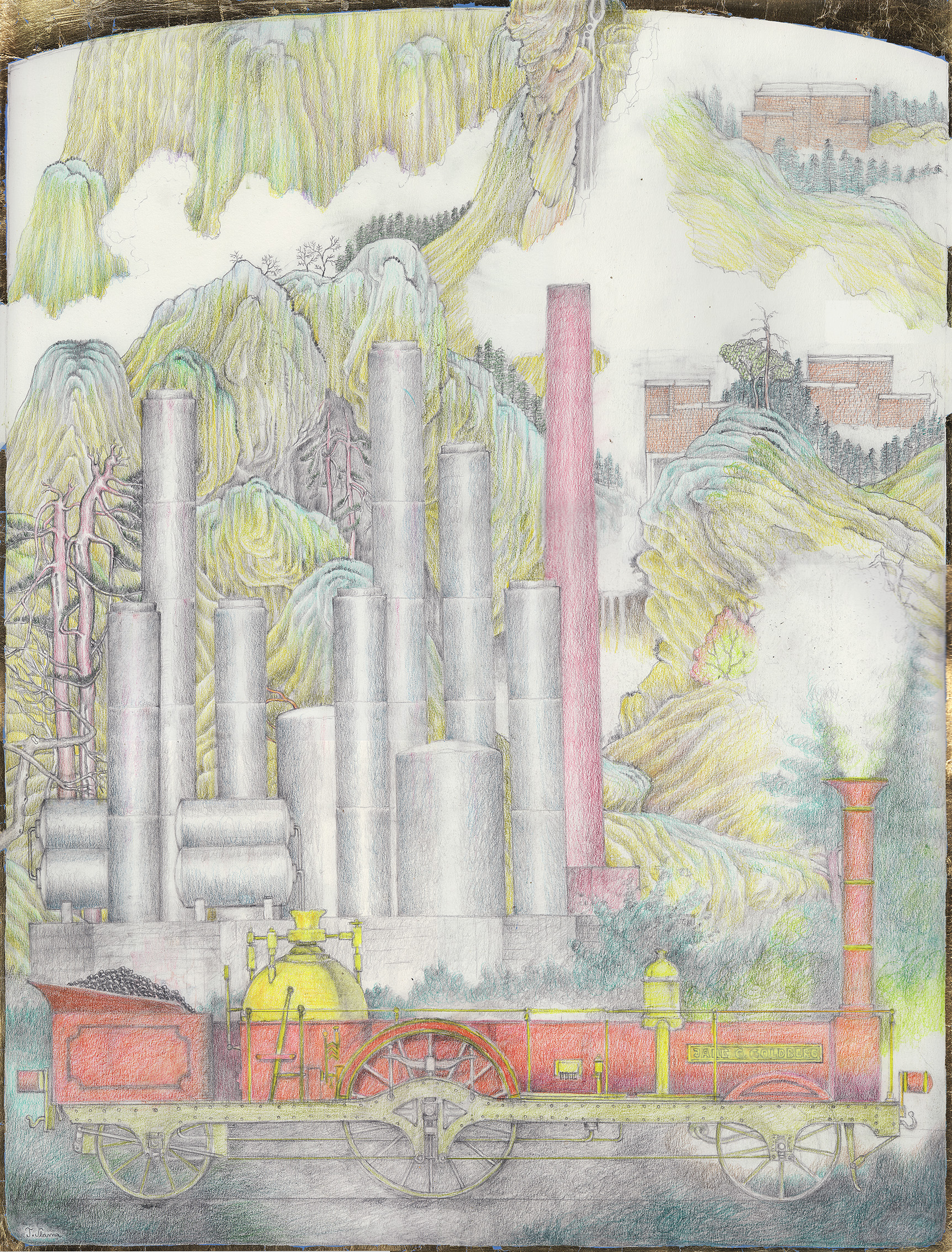
Das sehr wirkungsvolle Haarelixier (A4, 2015)

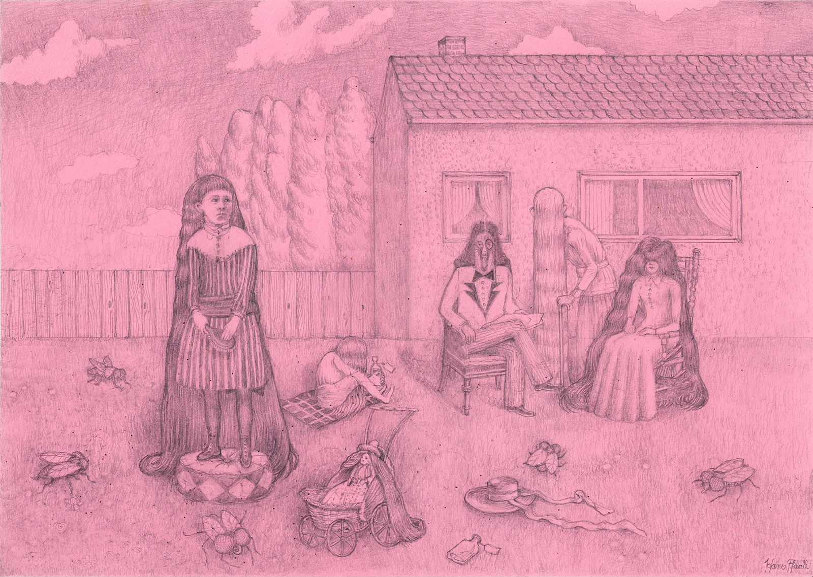
(What follows is perhaps somewhat rambling while striving to be an encompassing description of what is already there, yet undescribed, and maybe even better left alone and unmolested by words and hearsay-facts. Uncovered, named, listed, documented sources often form a thicket under which lies buried the depth of original conception, and the factual ambiguity of the term “original”. A term which to discuss is not the purpose of the following word-thicket.)

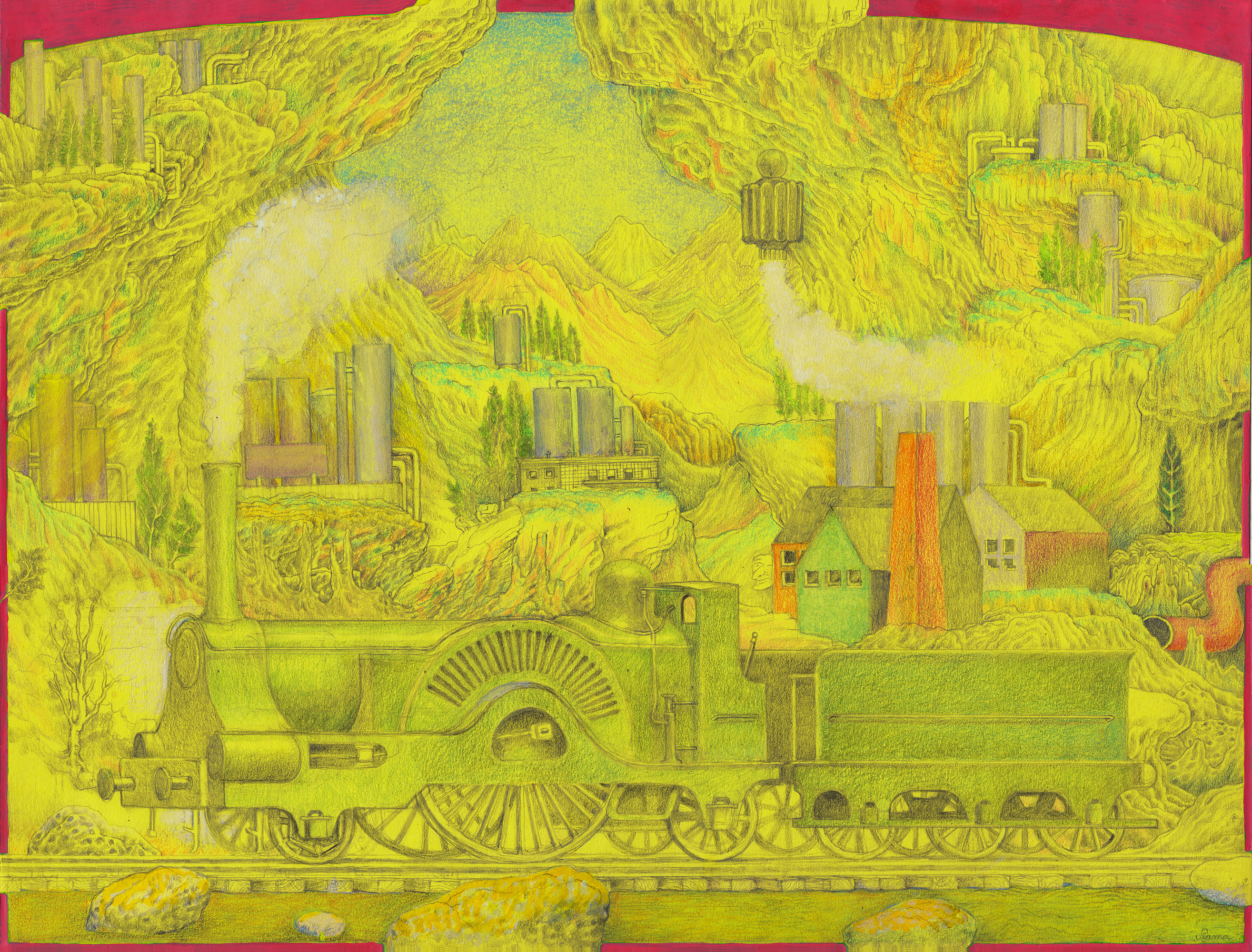
This drawing was made to serve as a decorative side-piece for a show in a special sort of gallery, showcasing original editions of books by Bruno Schulz. The drawing’s author (the “artist”), limited in his choices by the restrictions describing his own realm of inclinations, would not have chosen this author to draw inspiration from, yet found in himself a strong urge to do “something different” (something different, of course, from what he would naturally do). So it was an appealing idea to do something according to somebody else’s wishes. So it had to be a sort of illustration. It was not to be a paraphrase of Bruno Schulz’s own, often somewhat fetish-centric drawings. It is an illustration of a detail in the short story, “The Book”, an ad for a hair tonic mentioned therein. Some pictorial inspiration was drawn from one of this drawing’s author’s favourite oil paintings, “Mourning Picture”, by Edwin Romanzo Elmer. Since the drawing’s author does not get around too much, he has never seen that painting in the original. He first came across it in a book about “Naive Kunst”. For some reason, this painting was classified as that, among numerous Yugoslavian examples, some French, and a notable German entry, Friedrich Gerlach. It was only a black and white reproduction, not particularly crisp, but the cracks in the thickly-painted clouds were still intriguingly visible.

A nom de plume was chosen for this drawing which refers to Edgar Allan Poe. So the original accent is nicely rounded off by the American influence in the form of two late 19th century American sources augmenting or instrumentalizing one Polish-Jewish, 1937 modernist, original inspiration. What this means is that it tells you something about the drawing’s author’s mindset. The artist-illustrator would also maintain that there is a certain touch of Will Elder noticeable in certain details. Which then would make for a third, second half of the 20th century, modern-popular, as opposed to modernist, American influence. The above-mentioned pen name was “Hans Pfaall” (see signature in lower left corner), lending an additional phallic touch to the drawing, already well endowed with phallic forms (eight, or nine, depending on the viewer’s susceptibility to phallic forms). A touch of quaintness is the choice of pink tone-paper, in reminiscence to a certain cheap stock of recycled writing paper, not widely available anymore. The drawing originally also featured a cat (taken from the above-mentioned mourning-painting) with very long hair, which was then erased and replaced by a multitude of overgrown house flies (Musca domestica, of the suborder Cyclorrhapha). To complete the list of references, and, in the process, to add one German influence (an addition of questionable historical and moral sensitivity perhaps), the self portrait of the painter of the Mourning Picture, sitting in a lawn chair and reading a newspaper, originally moustached, wearing a bowler hat, had his head replaced with that of a dog-creature which is a rather faithful copy of a drawing by the German author Wolfdietrich Schnurre, who illustrated his own books. This dog face, bearing the caption “Arrogant, aber von Adel”, was featured in his 1965 novel “Die Aufzeichnungen des Pudels Ali”.

The drawing was never used for its intended purpose, it was not shown, for it was too attention-drawing. So it was sent back to the draftsperson (the drawing’s author). Drawing and explanatory note © 2021 by Torsten Slama and the International Balloonist’s Society for the Applied Arts